


The Truth About Colour Psychology (That I Couldn’t Say on TV)
May 2025 on Hello Iowa

When I appeared on a recent TV segment at Hello Iowa to talk about Pantone’s 2025 Color of the Year, Mocha Mousse, I was genuinely excited. As a fashion psychologist, I often explore how colour intersects with emotion — and Mocha Mousse, with its soft, grounded richness, gave me a lot to say.
Watch the segment here.
But in the limited time of a live interview, I couldn’t quite get to the heart of something essential:
Even the most “emotionally intelligent” colour won’t regulate everyone’s nervous system in the same way.
Mocha Mousse: A Colour That Holds Space

On air, I spoke about why this shade resonates with so many of us right now:
“Mocha Mousse feels like a warm exhale — it’s rich, grounded, and emotionally intelligent. It doesn’t demand attention, but it holds space. Psychologically, it invites calm, connection, and presence.”
And that’s all true — from a general perspective. Research in colour psychology supports that earth tones like this can reduce overstimulation and help us feel more grounded. They mimic the hues of the natural world: soil, stone, bark, skin — tones our nervous systems often read as safe (Elliot & Maier, 2014).

This was what I wore for the segment. I am a Deep Winter. I don’t wear warm hues. So this was the closest to Mocha Mousse I own. Why do I tell and show you that?
Because here is what I didn’t get to say on TV:
Colour Psychology Isn’t Universal. It’s Personal.
Mocha Mousse might regulate one person’s nervous system — and trigger another’s.
Yes, it’s warm. Yes, it’s earthy. But colour is never neutral. It carries memory, culture, identity, context. Which means our emotional responses to colour are as layered as we are.
Let me give you an example:
One of my clients recently bought a mocha-toned sweater because she wanted to feel calmer during a stressful period at work. When she wore it, she said she felt “quietly powerful — like I was showing up grounded instead of guarded.”
Another client, however, avoided browns altogether. For her, they reminded her of a strict school uniform — a tone she associated with constraint, invisibility, and erasure.
Same tone. Completely different emotional outcome.
What the Research Actually Says
This is where it gets interesting — and where nuance matters most.
Colour psychology does offer broad emotional tendencies. For example, soft browns are generally experienced as warm, stable, and comforting. But studies consistently show that our actual responses to colour are shaped by:
Cultural context
Personal history and memory
Emotional state
Even skin tone and surrounding colour combinations
In fact, research by Elliot & Maier (2014) emphasises that colour effects are highly context-dependent. Saito (1996) and Landa et al. (2020) further show that cultural norms and individual experience drastically alter how a colour is received.
So while Mocha Mousse might trend on the runway or in home decor, the key question for any individual is:
How does it feel on you?
Not just how it looks — but how it lands in your body.
Mocha Mousse as Mood, Not Mandate
Here’s what I wish I’d had time to say in full:
Mocha Mousse isn’t just a trend — it’s a mood.
But moods are personal. And emotional alignment in fashion isn’t about chasing colour trends.
It’s about using colour consciously, curiously, and in a way that honours your nervous system.
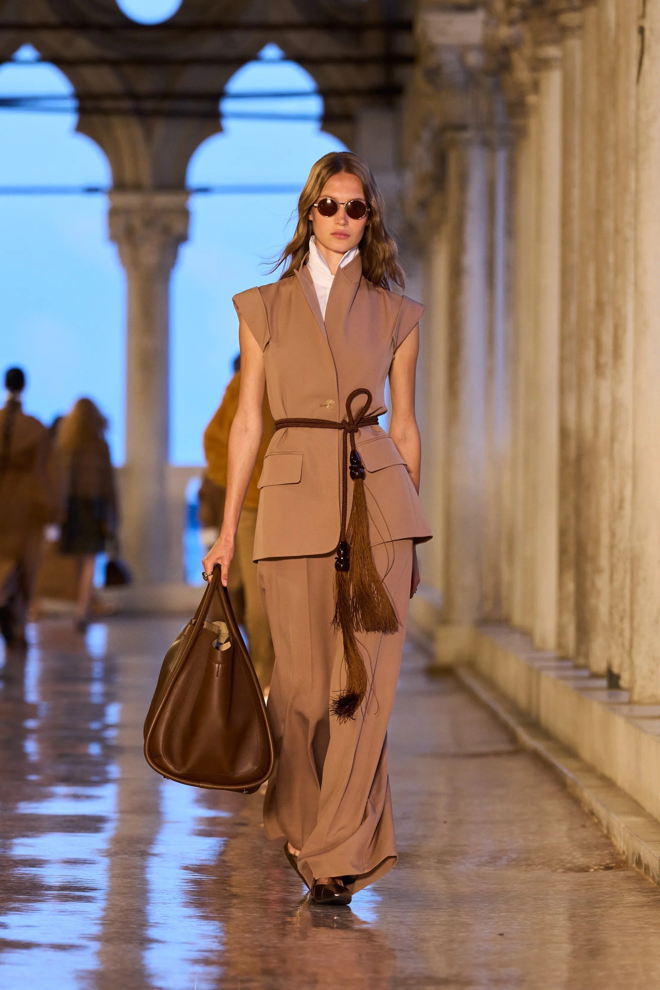
Max Mara Resort 2025 - Link to picture
Let’s Keep the Conversation Going
Is there a “calming” colour everyone seems to love — but you just can’t stand it?
Or a tone that helps you feel grounded, even though it’s not trendy right now?
Comment below. I’d love to know.
References (APA 7, alphabetically listed)
Elliot, A. J., & Maier, M. A. (2014). Color psychology: Effects of perceiving color on psychological functioning in humans. Annual Review of Psychology, 65, 95–120.
Landa, A. I., López-Pérez, B., & Richaud, M. C. (2020). Color-emotion associations: Cultural and gender differences. Color Research & Application, 45(1), 101–110.
Saito, M. (1996). Comparative studies on color preference in Japan and other Asian regions, with special emphasis on the preference for white. Color Research & Application, 21(1), 35–49.